Helping kiwis with dementia and their families navigate dementia, and get the support they need.
Alzheimers New Zealand supports people living with dementia, along with their families and carers, at some of the most challenging moments in their lives.
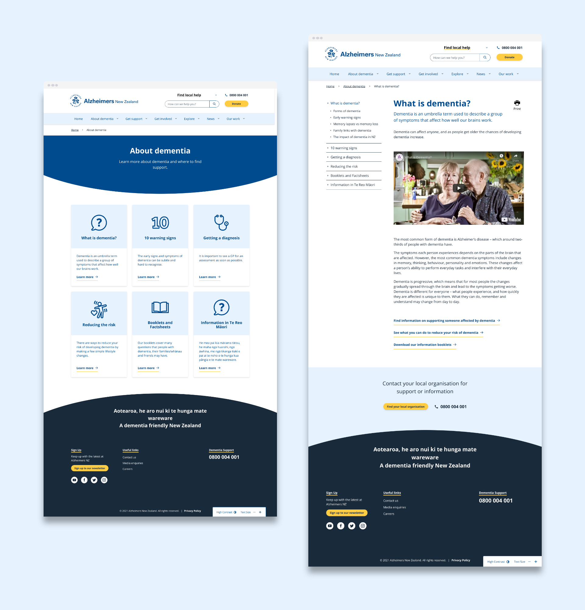
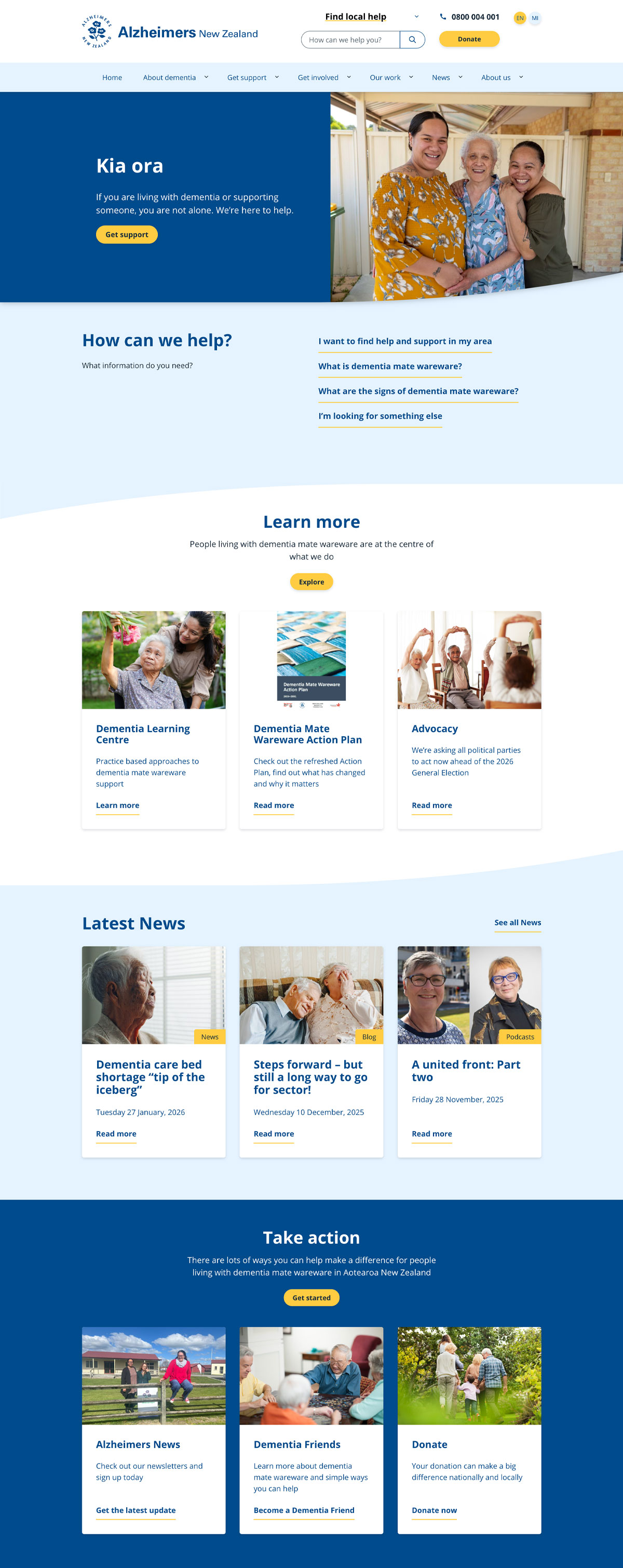
While at Scratch Design, I led the UI and UX redesign of the Alzheimers New Zealand website. Working within an existing brand system, with scope to thoughtfully evolve it, we reimagined the site to be clearer, more accessible, and more supportive. The focus was on creating a calm, user-friendly experience that helps people find the right information quickly, especially when navigating stress, uncertainty, or emotional overload.
➔ alzheimers.org.nzWhile at Scratch Design, I led the UI and UX redesign of the Alzheimers New Zealand website. Working within an existing brand system, with scope to thoughtfully evolve it, we reimagined the site to be clearer, more accessible, and more supportive. The focus was on creating a calm, user-friendly experience that helps people find the right information quickly, especially when navigating stress, uncertainty, or emotional overload.

Working within established brand but elevating and modernising.
The old branding was dated and needed a refresh while still retaining some of its well known assets.
I shifted the brand to be more modern and friendly, while still being sensitive and informative.
I shifted the brand to be more modern and friendly, while still being sensitive and informative.

The existing brand relied heavily on purple and lacked a clear accent colour. As part of improving the UI and UX, we carefully evolved the palette — retaining the core brand blue while introducing a considered highlight colour. Accessibility was central to every design decision
Establishing a clear repeatable system.
The site needed to support hundreds of pages of content, often accessed in moments of distress. The UX prioritised clarity, accessibility, and predictable patterns to help users navigate complex information with confidence.
I created a calm, repeatable interface that respected the existing brand while softening the visual language to feel warm and reassuring. Accessibility and function led the design, supported by thoughtful, human-centred aesthetics.
I created a calm, repeatable interface that respected the existing brand while softening the visual language to feel warm and reassuring. Accessibility and function led the design, supported by thoughtful, human-centred aesthetics.

I introduced a clear, consistent icon set to support wayfinding and distinguish different levels of content. The icons also extend the brand system — a simple visual language that improves clarity while reinforcing the overall identity.


