HELPING BUSINESSES MAKE BETTER DECISIONS.
Dot Loves Data was acquired by ANZ in late 2022, while continuing to operate independently. Preserving Dot’s design-first mindset was critical — it’s what sets the business apart in a category often dominated by complexity and convention.
As part of the rebrand, I led the design and creative direction for the marketing website, shaping both the visual language and the build. The site balances rigour with personality, designed to support large organisations making high-stakes decisions, while still feeling human, confident, and distinctly Dot.
➔ dotlovesdata.comAs part of the rebrand, I led the design and creative direction for the marketing website, shaping both the visual language and the build. The site balances rigour with personality, designed to support large organisations making high-stakes decisions, while still feeling human, confident, and distinctly Dot.
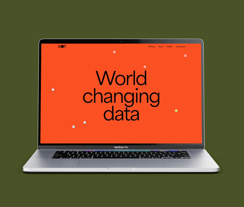
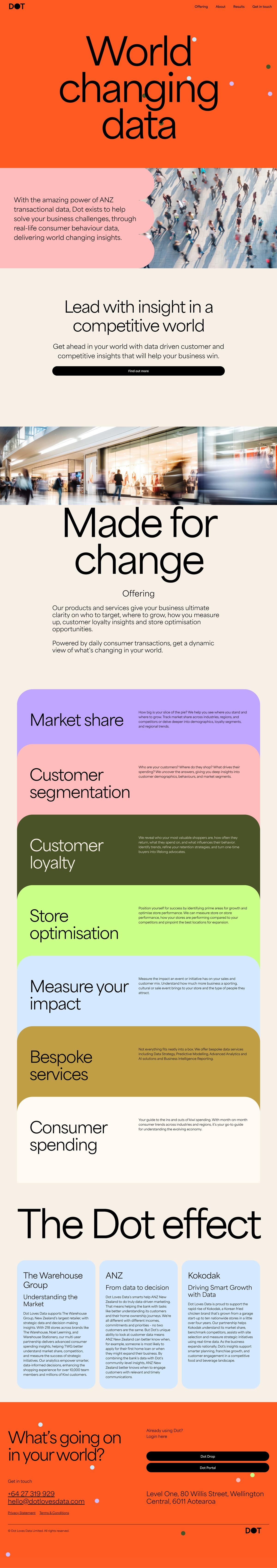
A confident entry point that distils the brand and invites exploration.
Dot’s data is unparalleled. The opening experience is designed to make a strong first impression, using subtle animation and restraint to intrigue users, signal confidence, and hint at the depth of insight Dot delivers.
Establishing a clear repeatable system
The site had hundreds of pages of content that needed to be easy to access in times of distress. The UX needed to be very clear and accessible as users navigate multiple information layers.
I designed a clean, calm interface that stayed true to the existing brand while softening the palette to evoke warmth and trust. Functionality led the way, but aesthetics were carefully considered to make the experience feel reassuring.
I designed a clean, calm interface that stayed true to the existing brand while softening the palette to evoke warmth and trust. Functionality led the way, but aesthetics were carefully considered to make the experience feel reassuring.

Strong and simple, Dot does things differently.
I translated Dot’s confident brand into a clear, flexible visual language for the website. Every element — typography, colour, layout, and tone — was carefully crafted to work together, creating a system that feels bold yet considered.Alongside the visual design, I shaped the site’s language to be direct and decisive, ensuring the message is immediately clear to decision-makers.
The result is a cohesive experience that brings Dot’s brand, voice, and thinking into sharp focus.
The result is a cohesive experience that brings Dot’s brand, voice, and thinking into sharp focus.

Photography plays a critical role in the site — signalling confidence, scale, and credibility. Retail imagery grounds Dot’s playful personality in real-world context, reflecting both the depth of its data and its distinct point of view.


Bold visuals, beautifully refined.
Dot’s new brand uses strong, distinctive shapes that are never decorative — every element serves a purpose. The challenge was to let the brand feel unapologetically confident while remaining refined and intentional. Colour and pattern are used boldly, but always with clarity and simplicity in mind.
Let's talk.
© Sandidash Limited. All rights reserved.