Creating a brand system that feels distinct, collaborative & unmistakably Xero.
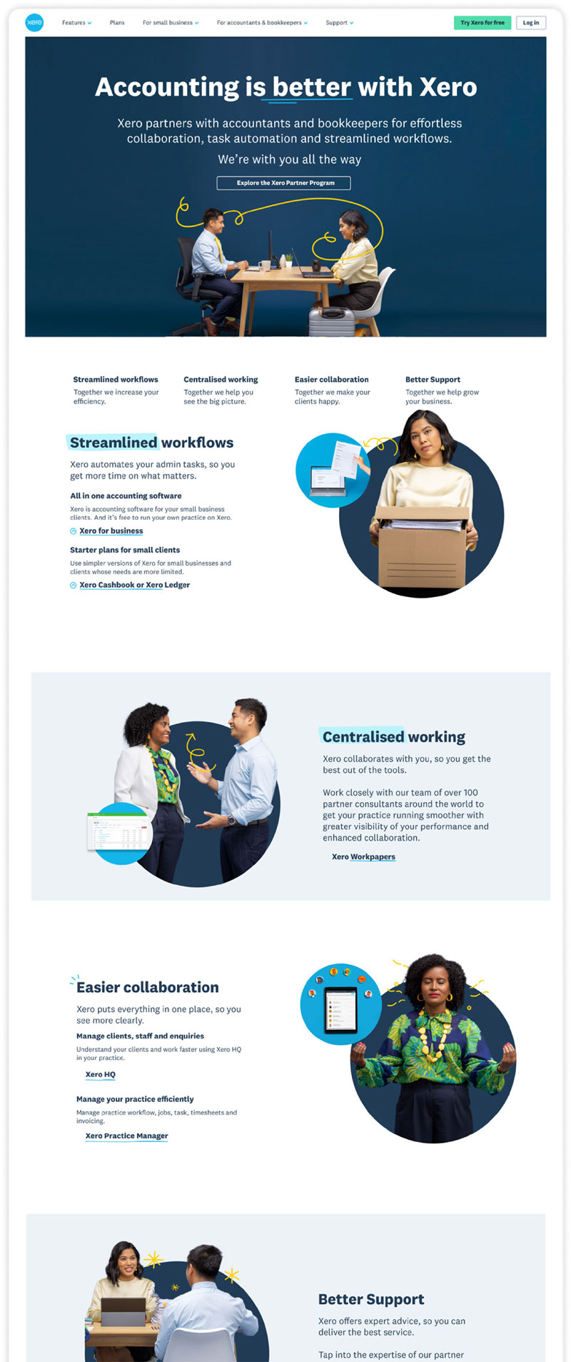
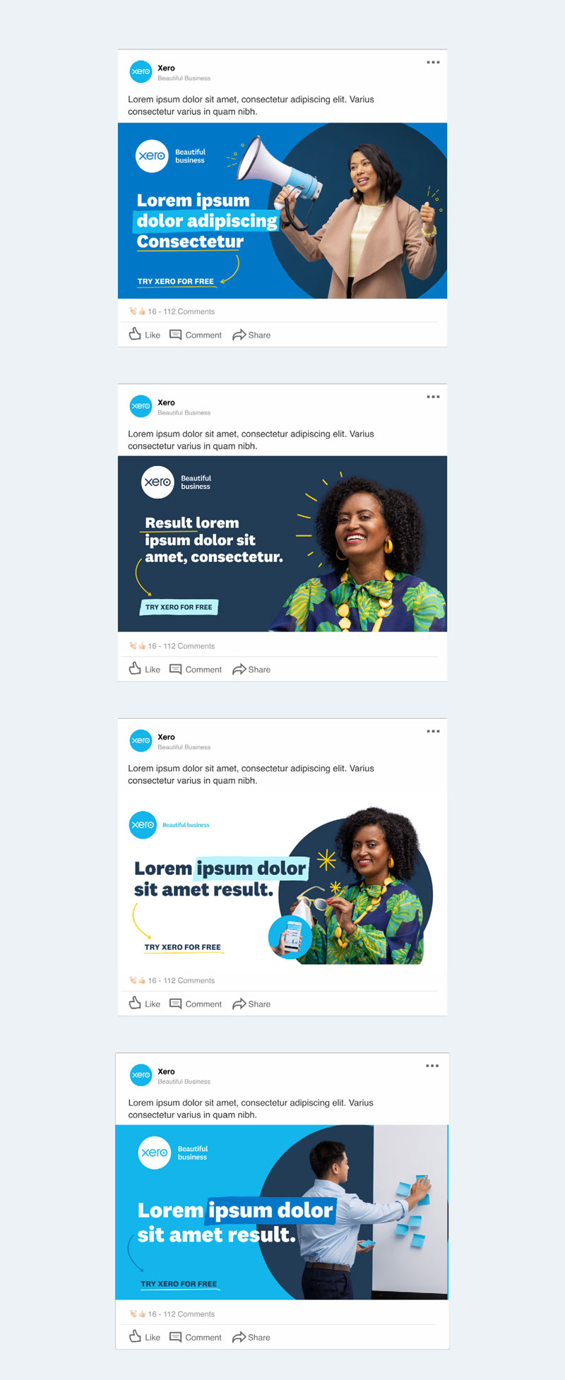
Using the platform of ‘better together,’ I was tasked with creating a tailored branding system that specifically targets partners (accountants and bookkeepers). We needed to make sure the branding system fitted comfortably within the wider Xero branding, yet felt different, fresh and unique to partners.


Introducing a unique brand element that leverages off existing assets.
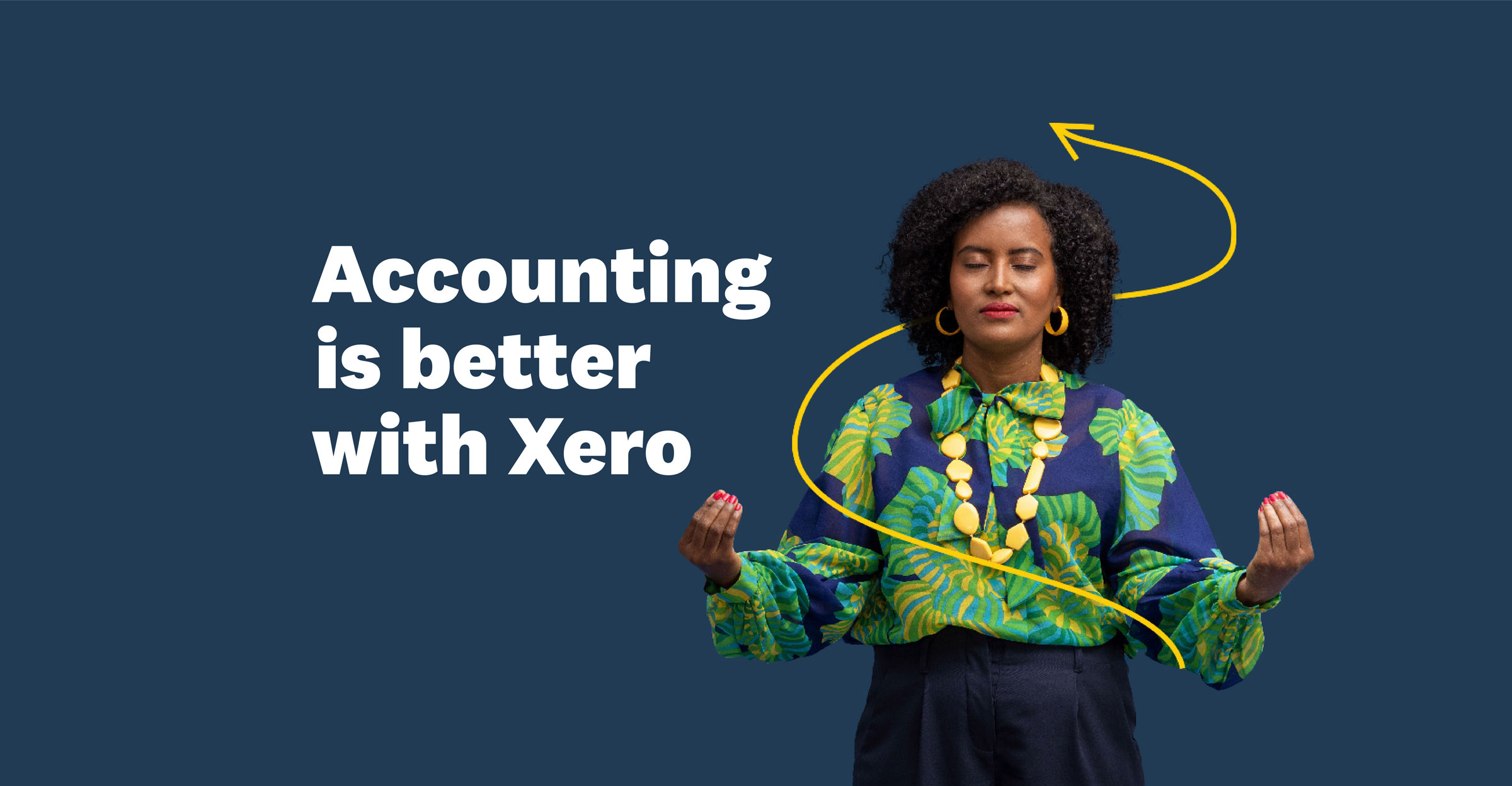
Yellow mnemonics were created as a unique element to the Xero partner brand look and feel to be used primarily on the dark 'partner blue'.
The yellow mnemonics were a natural progression from the already widely used Xero blue mnemonics, creating a sub-brand that seamlessly slotted in to Xero's wider world.
The yellow mnemonics were a natural progression from the already widely used Xero blue mnemonics, creating a sub-brand that seamlessly slotted in to Xero's wider world.


Photography and relatable depictions of partners and clients are very important for partner audiences.
Using a photography led brand system, with a touch of the newly introduced yellow mnemonics; the brand system shows realistic depictions of partners within Xero's beautiful whimsical world.


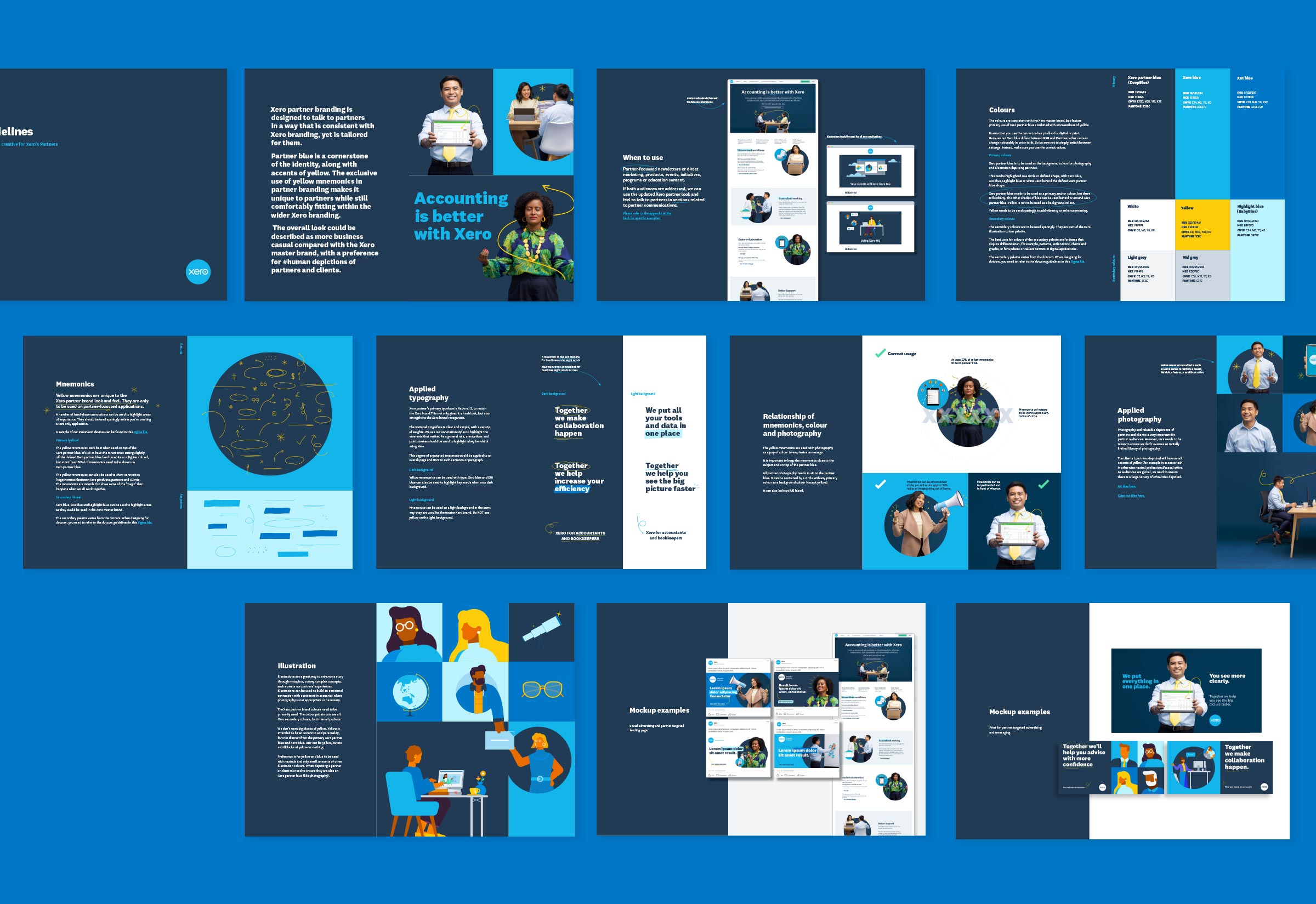
Creating a easy to use brand system.
As Xero has a large global creative team, I was tasked with creating a complete set of brand guidelines that future-proofed how different applications of the brand would roll out.

